Fall 2018 One Room Challenge - Week 2: Design Direction
/It’s already Week 2 of the One Room Challenge sponsored by Better Homes and Gardens and I’m fresh off our Canadian Thanksgiving long weekend, recovered from turkey coma, back on the treadmill and have nothing to show as far as progress goes …
But I do have a plan and I promise that both rooms will be beautiful by the end of the challenge no matter what!
Today I’m sharing my design plans and inspiration for both spaces, using many antique and vintage finds for a layered look that has been achieved over time and not over the short 5 weeks of this challenge.

Audrey’s Big Girl Room - Mood Board
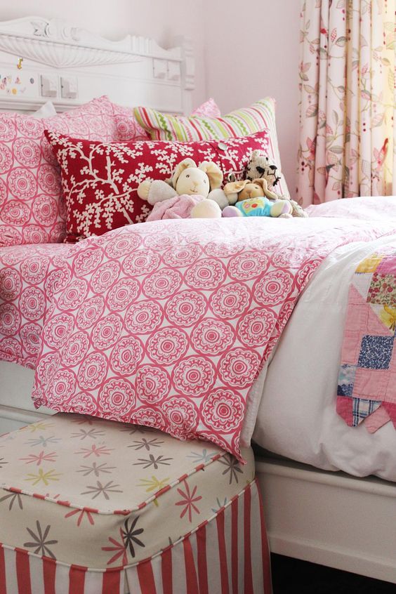
Both little spaces for this challenge are inspired by bold colour starting with red & purple in Audrey’s Big Girl Room. I know what you might be thinking … red and purple is not your everyday combo but when done properly I think the results are stunning.
Years ago I came across this bold painterly fabric in the dressmaking section of Fabricland and was determined to use it someday. At only $3.00 a meter I bought the entire bolt at our Orillia store and also bought the bolt at the Barrie store. This fabric is the jumping off point for the entire design and will serve as beautiful pinch pleated drapes for the room.
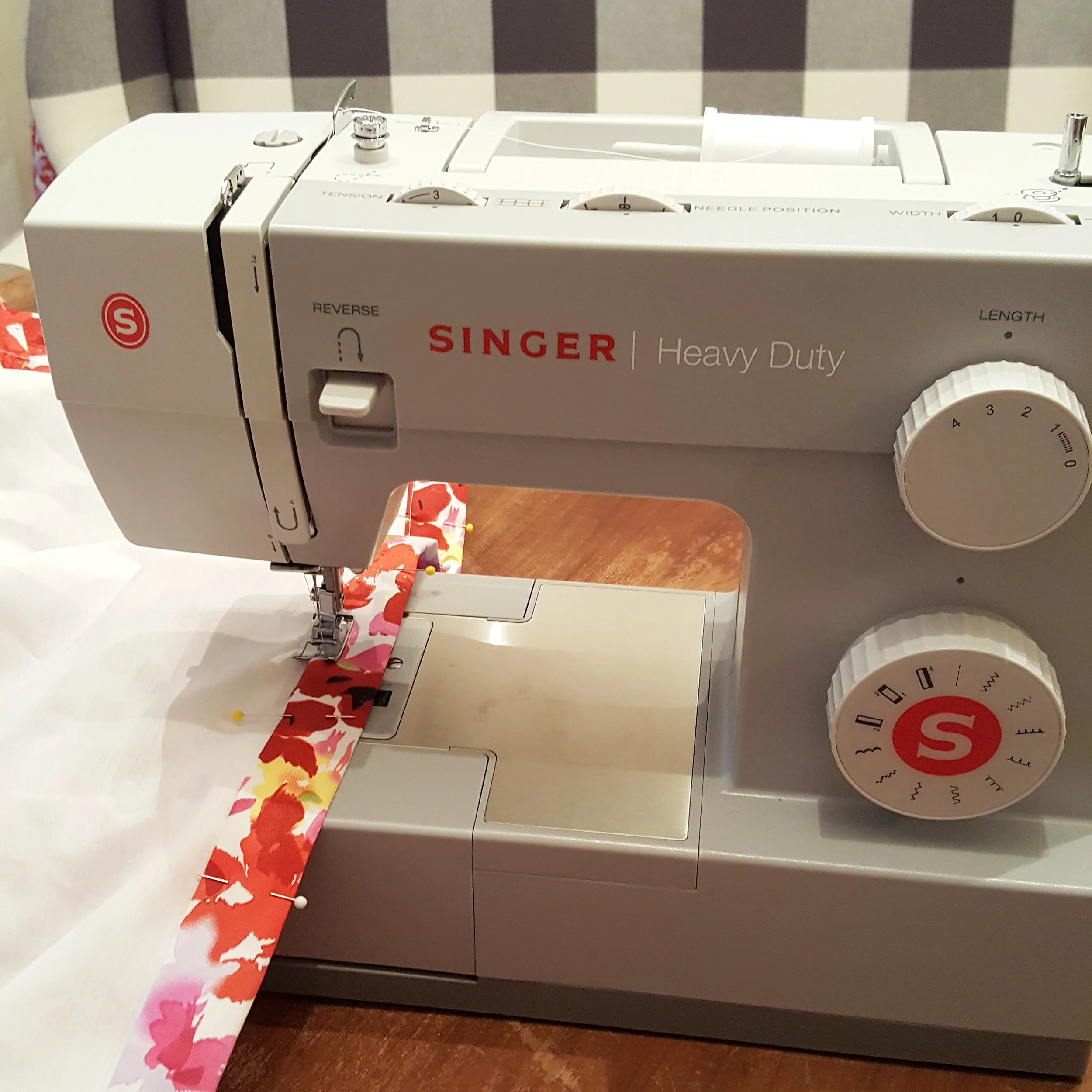
Late night sewing
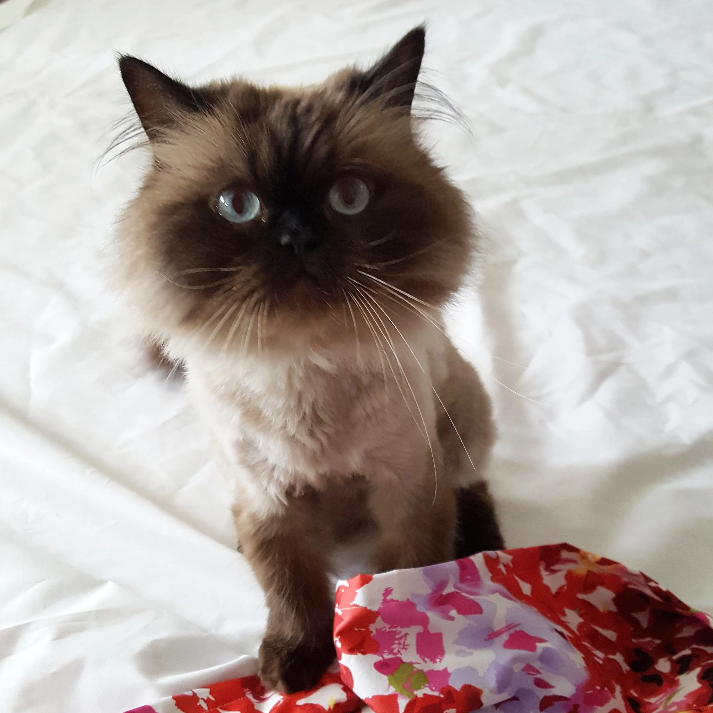
Our not-so-helpful helper “Poppy”
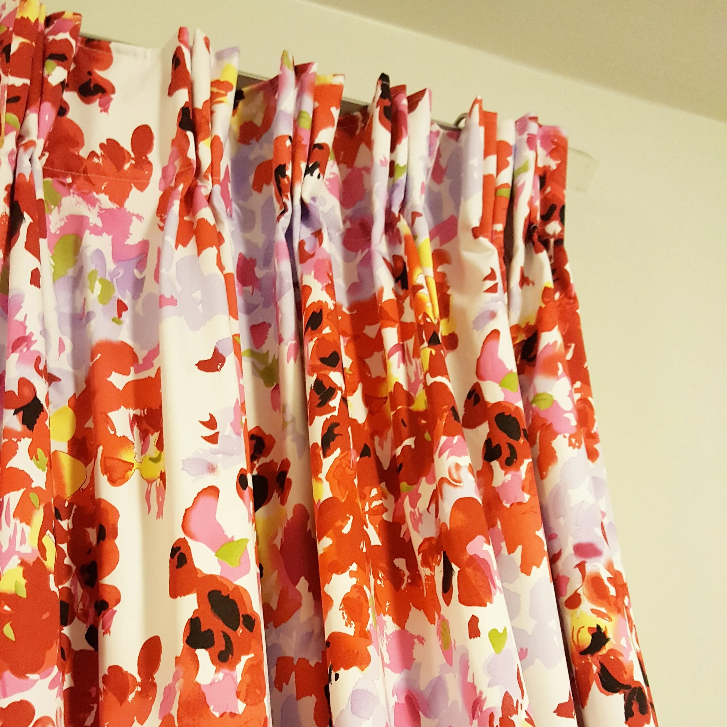
Custom pinch pleated drapes
We’re going to paint Audrey’s room in the softest lilac to add the slightest hint of colour. On my Week 1 post when I said “we’ll be working with what we already have wherever we can for truly ‘redesigned’ spaces” I meant it - right down to the paint. Both Paul and I have part gallons of bathroom paint that we used for projects in our own homes - mine in Sarah Richardson’s “Gown” and his in Benjamin Moore’s “Misty Lilac”. We’re going to mix the 2 cans together to avoid having to buy more paint and we’ll end up with a beautiful custom colour.
Here are a few rooms that I’ve had in the back of my mind that are inspiring the design for our red & purple palette:
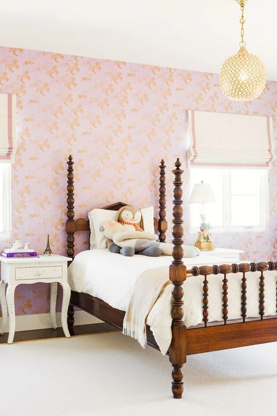
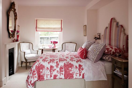
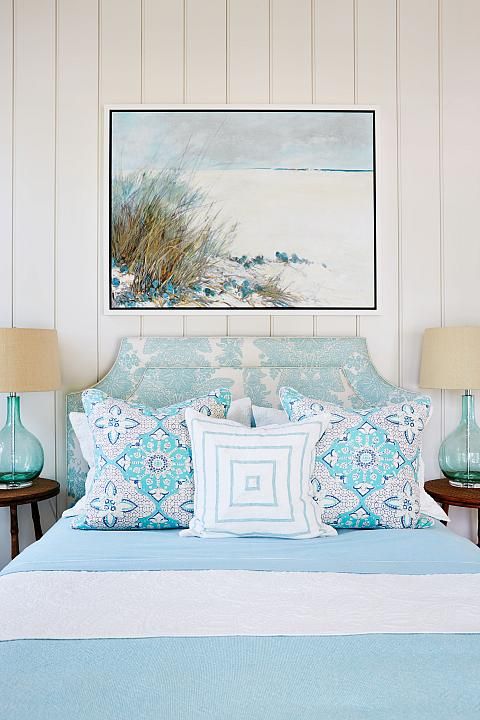
Natalie Hodgins of Sarah Richardson Design

Clark’s Nursery - Mood Board
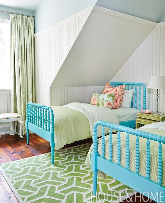
For Clark’s nursery we’re going for a cooler colour palette of blue & green. I’ve been hanging onto my son Matthew’s blue and white cabana stripe drapery panels from his nursery years ago. They were beautifully made and still in amazing condition so we’re going to make them work in this space.
The plan is to paint the room in Benjamin Moore’s “Cloud White” using extra paint from projects around my home, add blue and white through the draperies and a punch of bold green through a redesigned dresser.
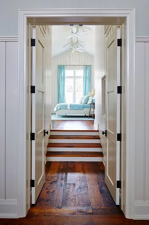
Nobody does blue & green better than Sarah Richardson Design:
Fingers crossed that we’ll be able to complete trim and painting over the next week so we can focus on pulling everything together. I have some sourcing and purchasing still to do as well as printing and framing great art from Jenny’s Print Shop featured in the mood boards.
Wish me and other guest participants and featured designers luck over the coming weeks :)
Carley